Losing It by Cora Carmack
This is the original ebook cover

The reprints of the book in various formats have different guys on the front, but all are bad. However, I thought this was the worst. I mean, what even is this? That guy looks like a teenage wannabe rapper/druggie, with a dodgy photoshopped necklace, and the girl has a freakishly long neck, and looks dead, not in the throws of what I guess is supposed to be some kind of sex-induced haze. This is bad. This is so bad. I CANNOT UNSEE THIS. As Erin at Forever Young Adult put it, "at least Fifty Shades of Grey had that stupid stock photo of a tie". Indeed, Erin. INDEED.
Transparent by Natalie Whipple
This is the UK paperback cover

The US version is actually okay, but this is a monstrosity. Any hopes of it attracting boys to read it have vanished without even seeing the synopsis, and the girl's glasses are sideways. This makes no sense? The weird Photoshopped men in the background add nothing to it, and I would be completely embarrassed to be seen with this in public.
Crash Into You by Katie McGarry
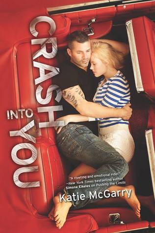
I haven't read the previous books in the series as they don't seem like my kind of thing, but the covers do nothing to draw me in. This one is probably the worst yet. The guy looks about 30 YEARS OLD, for God's sake. Why? Why is it necessary to put thirty year old actors on the front of books about seventeen year olds? Guys my age DO NOT LOOK LIKE THIS. Got that, Harlequin Teen? The girl is slightly more realistic, I suppose, but she definitely looks older than a teenager. This cover makes the characters look horrifically stereotyped and clichéd and frankly, I don't want anyone to see me reading this, and definitely not my parents.
Not That Kind of Girl by Siobhan Vivian

This is a fantastic book, and it does NOT deserve this cover. I'm surprised that it hasn't been repackaged, but clearly, the publishers like this cover. I DO NOT. I don't want to read a book where there are big (possibly) teenage faces almost-kissing on it. I was too embarrassed to whip this out in front of anyone. It just makes it look so much like run of the mill chick-lit (it's not). Push, please re-do this ASAP!
I could go on and on about the frankly mortifying covers that New Adult books have, featuring variations of the "romantic clinch", usually with tattooed guys and "innocent but sexy" girls. THEY ARE VILE. You're giving books a bad name.
To end on a more positive note, I'll show you a brilliant cover. It's simple, beautiful, and it represents in the story in a completely understated way. Book cover art people, you need to learn from this leader of greatness:

Happy reading, and I hope you find some great covers out there!
No comments:
Post a Comment